
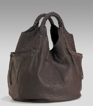
Ever since Graeme Black (formerly with John Galliano and Armani) joined Ferragamo as head designer, the house that revolutionized shoes was back on the scene with a fresh collection of bags. No longer your bitty granny’s handbag collection, Ferragamo’s recent designs have been cutting edge and quite funky. Just look at this hobo, void of buckles and chains, it is totally hip and young with interesting woven leather details. The color is so great for Fall, it is a soft muted chocolate and works like a black bag without being a black bag. This shape is also not a typical hobo, it is a cross between a bucket and hobo. I love how it hangs so close to the shoulders, it makes the slouchy style less sloppy. Now for the downers, the pockets on the sides are great but are too deep for them to be a real time saver when it comes to finding tiny knick knacks. But the bigger issue I have is with the giant perforated Gancini logo in the front. Yes, it is subtle and is not a gold plaque, but still, it bothers me. Of course that is just us who like all our stuff sans logos. If you are loving the new look at Ferragamo, you better jump on it because Graeme just left the company last week to focus on his own collection. At Neiman Marcus for $1350.


The minute I saw the picture of this bag I thought it was ugly – and I expected you bag snobs to tell us just how ugly. I am surprised. If this bag was a giveaway I would skip.
I LOVE this! Neiman’s website says the logo is on the front, meaning that one can always carry it backside-out if they prefer no logo, but I do admire the attempt to understate it. I am a logo-hater. Great color. My one concern is that you can’t keep it hanging on your shoulder while you reach in to fumble around for your whatevers (a habit I have)–I’d like to “try it on.” At least it shows evidence of effort and thoughtful design–how nice!
I love the color, shape and I can even deal with the pocket issues but the perforated logo. What’s the deal with that?? I’m not a label loving person either but I might make an exception for this lovely : )
I like it. I think I’ll go call NM’s. As far as the perforated logo? That’s ok, it’s subtle plus doesn’t Hermes do this with the Evelyne?
Saw this today and loved it — except for the accursed perforated logo. That broke the deal for me.