
![]()
I just needed to get this out of my system, the throw back Gucci logo is really really ugly. It is grandmother-ish and vintage in a “has been” kind of way. Which actually describes the entire Fall collection with this logo. Maybe I’m totally off base and they have a specific customer they are going after (grandmothers) but it is making me feel like they have no clue what is cool. There is cool vintage and there is “so glad it’s done and gone” vintage. Even if I was Bianca Jagger trying to relive my Studio 54 days, this would only remind me of all the things that should be forgotten.
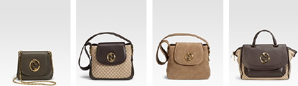


I agree! Although the little green one isn’t so bad.. But the others; what were they thinking?!..
OMG. I have been hating it TOO!!!! Why would they do this???
I actually like the logo. I think it is pretty cool looking.
I love the LOGO. I can remember my mom and aunts with Gucci bags with this logo. I actually have an old vintage from my aunt and I get major compliments on the bag. In 73 I was only 4 yrs old & I can still remember thinking “when I get big I want to the bags and shoes my mom and aunts had.” This was a time when women had so much class and style. They were ladies at all times. Their class and style looked natural and not like they were trying hard. Maybe I like the throw backs because I have fond childhood memories. It was a time when the woman made the bag and the bag didn’t make the woman. There was no such thing as the “It Bag”.
I really like the logo. I like the bags, and I think that they will sell quite a few of them. These bags are not meant to be “cool”. They are meant to be classic and worn years from now. Cool bags are really for the Balenciagas of the handbag world. I would love to own the one on the end. I can’t wait to go to our Gucci store to look at these. The bags are pure class.
No offense to the writer, but I was a little taken aback by the article. I read this blog everyday, but today, I found this one to be especially snarky and off-putting. Trust me, the ONLY thing that offends me is the N-word so I take no offense to it.
LOVE the logo…. I think you should probably take a poll on this one
I don’t like the logo and I don’t like the bags. Looks like they were made in the 70’s but in a bad way.
Hate the logo and the bags, look like something you’ll find in a bad vintage store. I don’t considered this classic, a classic is something that looks actual no matter whats, and these bags don’t.
It’s grotesque like a Halloween Caspar the Ghost mask! Worse yet, sometimes the logo doesn’t line up at a right angle with the shape of the purse, and the whole thing looks off-kilter. Weird–rather that competing with other brands, Frida at Gucci seems to be preoccupied with outdoing prior incarnations of the brand. The “ghost mask” is the ghost of Gucci’s past!
i actually like it. its a lot better than the red & green stripe…
Personally, I don’t like logos – I think they’re tacky. But yes, I agree on your take that they really look dated. What strikes me as humorous is that some clothing pieces in the collection recall Tom Ford’s very modern Spring ’98 collection, and with these dated bags, the collection as a whole is really disconnected. I’m all for brands doing retrospectives, but make them reinterpretations, and make them cohesive and fresh.
Not only do I love the these bags, I just bought the third one in the picture. The bag I bought is classy and it may not be for everyone.
You are way off base with this one. Coolest vintage collection and celeb favorite.